My name is Olamide Ajisafe. My candidate number is 8010. I am in a group 3 with Jerom Thambipilliai (8692) and Matthew Davies (8511). To see my work, please click on the 3 labels on the right named A2 Research and Planning, A2 Construction, and A2 Evaluation.
Below is our finished music video...
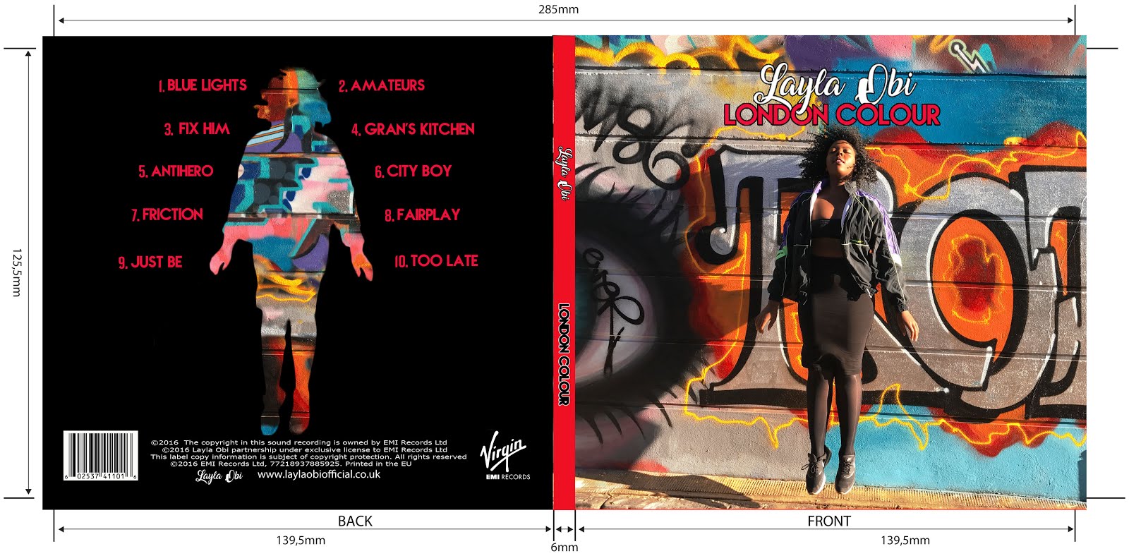
Below are the external panels of our Digipak. Left is the back and right is the cover
Below are the external panels of my Digipak
Left is the back of the album and to the right is the front
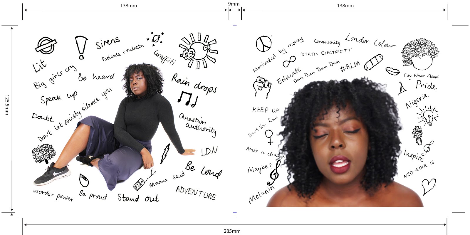
Below are the internal panels of our Digipak
Below are the internal panels of our Digipak
Below are the internal panels of our Digipak
Click on the image below to be directed to our website
Monday 19 December 2016
Construction Post 6: Website Post Production
We used the software Wix in order to create our website. Although this is a software I had not previously used, by the end of this process I am very confident using it and its tools. A website is very important for an artist as it acts as a hub for all of the information about them. In addition to this, we wanted our website to be an interactive place where fans of our artist could find opportunities to get involved in activities as well as view exclusive content.
In order to stick to convention we wanted to create a landing page. After researching into other artist's websites I decided that I would use our artist's album cover as the background for this page. This would immediately advertise our new album to any viewer of the website, increasing our reach to our TA and therefore increasing the likelihood of sales. Other artists such as Alicia Keys have also used this technique which I think is very effective...
Alicia Key's landing page
Our landing page
In addition to this, the repetition of the album cover image helped to create a brand for our artist due to the synergy it created.
Once the viewer enters the site via the 'continue to site' button, they are navigated to the home page. Here, they are greeted by a compilation of short clips that I sourced from outtakes which were later edited by Jerom. We were inspired to do this by looking at the sites of artists such as Izzy Bizu and Drake who have videos that automatically play in their background. This appealed to us as it was immediately engaging and showcased the artist. The button 'Listen' links to our music page, once again advertising our new album.
A snippet of our home page
A snippet of Izzy Bizu's homepage
The tool bar is a very essential part of a website as without it, the viewers would be unable to navigate their way around the site. After receiving feedback from a member of our TA, we decided to change the name of the page 'Live' to 'Tour Dates'. This was to make our pages clearer so that TA members were more likely to spend more time on the site.
We were also told that our social media icons blended in to our footer too much as they were originally black, so I changed the theme to one that stood out more in order to encourage viewers to click on them. Having social media was very important to our artist as it allows them a way to interact with their audience. For this reason, I created an Instagram account for our artist. Having different social media platforms meant that we could broaden the reach of our artist as well as offering fans exclusive material. This is also a good example of cross media convergence as the website is able to advertise and link to all of these different media texts.
The Instagram account I created
Next, I created the Music page. Here I put the finished music video along with an album track. The album track once again showcases the album cover, creating a consistent image, whilst the final music video creates new imagery. Below the final music video I wrote a quote that the artist would have said about their new album. This helped to give the website a more personal feel, increasing the audience's ability to relate to the artist.
Our music page
We also wanted an area on our website where fans could view pictures and images of our artist which lead me to creating the Gallery page. This page gave a variety of different formats to look at such as pictures and videos. With these images I took the opportunity to create some mutually beneficial relationships with different brands. For example, once the picture on the bottom right corner is hovered over the caption "Thank you sleek for some treats #SleekMakeUp" can be seen. This creates a symbiotic relationship with this brand as they are sponsoring the artist, whilst the artist also advertises their make up to members of their TA that may want it.
Gallery pictures
Below this, I created an exclusive behind the scenes video which can only be seen on the website, acting as an incentive for fans to go on the website. This short video can be seen below...
I then created the 'News' element of this page. Here, fans could keep up to date with any events that Layla Obi had. For example, I created a competition in which fans had the opportunity to meet the artist if they entered a competition by using the hashtag #MeetLaylaObi. This made our website more interactive for the viewer as well as encouraging them to advertise our artist further through the use of the hashtag. As Andrew Dubber once said, "Today a music website is a place where people gather and connect with an artist and with each other." and so by encouraging our fans to share posts, we will be creating an online community for them to connect through.
Our competition
The button gadget
I then create the Tour Dates page by creating a table in Photoshop which consisted of different dates and venues. After this I placed this into Wix and put a 'button' gadget on each row under the column 'Tickets'. Once I did this I edited the text on each button to say 'Tickets'. I then linked each button to the Ticket Master website so that when the button is clicked on you are immediately directed to the Ticket Master website. Unfortunately I think that this is one of our least visually engaging pages as I was unable to put the fairy light detail that I had wanted around the edge of this page due to constriction of the template we had chosen. Despite this, I think that all of the relevant information required in order for the page to fulfill its purpose is included.
How I linked the buttons
The next page I made was the Merchandise page. In order to make our merchandise options more interesting I created a variety of products such as a phone case, a mug, a beanie and a backpack by duplicating the brand template that Matt had created onto different items. This helped to create a larger ranger of items which is beneficial from a marketing perspective as the more options a consumer is given, the more likely they are to find an item that they like and eventually buy.
Our Merchandise page
I then combed through this page, adding little details such as product information and shipping details so that our site was more informative and appeared more realistic.
Product details
The 'More' section consists of the pages 'Bio' and 'Sign Up'. Here, extra information about the artist as well as the option to sign up to the website mailing list are presented. For the Bio page I created a backstory for our artist. This is so fans could find out as many details about our artist as possible in order to fulfill their want to know more about idealised figures. As well as this, I created a Q and A in which the artist answered more questions about herself.
The bio I wrote
The sign up page gave the viewer the option to create an account with the site, allowing them to receive any information regarding Layla Obi.This is important as it means that we can directly interact with fans and increases our reach.
Our sign up page
Overall, I am very pleased with how the website turned out as I believe that I created one that was both informative and interactive as well as aesthetically pleasing.


No comments:
Post a Comment